You can now make your website with your mobile device all with the simple click of one button.
Here are step-by-step instructions on how to turn on your mobile layout and how to customize what shows up on your site when you view it on a mobile device.
Step 1:
Make sure that you have Mobile Layout enabled.
To do this, go to your Site tab and click "Turn On Mobile Layout" under Site Settings.
To make sure it works, you must click SAVE!
Note: You will notices that if you have a free account, this option is not currently available.

Step 2:
Create your site!
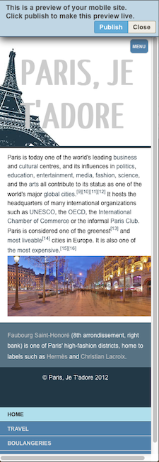
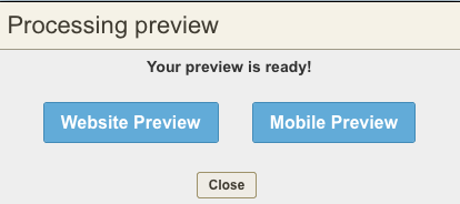
Once you're done filling in your website with all of the content that you want and with all of the add-ons that you need, click "Preview" and then select "Mobile Preview" to see how your website will look on a mobile screen.


Step 3:
Once you have seen the preview of your mobile site, you can go back to your editor and make any changes that you need.
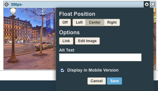
If there are images or modules that you do not want to appear on your mobile website you can click on the cog of that module and un-check the box, "Display in Mobile Version."

Step 4:
Click publish to make sure that others will be able to view this version of your site when they visit it on a mobile device.
Custom Style Tips:
If you built custom CSS into your style, you must make sure that your CSS for the mobile layout matches the CSS for your website. For example, if you changed the background image of your website, if you don't change the background image in your mobile layout CSS, your mobile version will display the original style's background image.
To check and edit your website's CSS, view the CSS editor in Source View and scroll all the way to the bottom. If you have simple change to make, easily edit the mobile CSS under the section that is marked off for mobile layout. Match the changes that you made in your regular website to the CSS in the mobile version.
If you are not seeing the section marked off 'mobile layout' at the bottom of your code, you can add in the code below and customize it to your liking:
______________________________________________________________________________ */
@media screen and (max-device-width:480px), screen and (max-width:600px){
/* adds mobile only background */
#body.mobileLayout{}
/* style for menu button at top right of page */
#body.mobileLayout #mNavLink{}
/* styling for navigation menu to be placed at bottom of page */
#body.mobileLayout .mobileNav ul{}
#body.mobileLayout .mobileNav ul li a{}
#body.mobileLayout .mobileNav ul li a:hover,
#body.mobileLayout .mobileNav ul li a.selected{}
/* mobile layout/content styling */
#body.mobileLayout #outerContainer{}
#body.mobileLayout #header{}
#body.mobileLayout #main{}
#body.mobileLayout #content{}
#body.mobileLayout #sidebar{}
#body.mobileLayout #footer{}
}
Just place this at the bottom of your code and fill it in with your changes, click publish, and you're good to go!